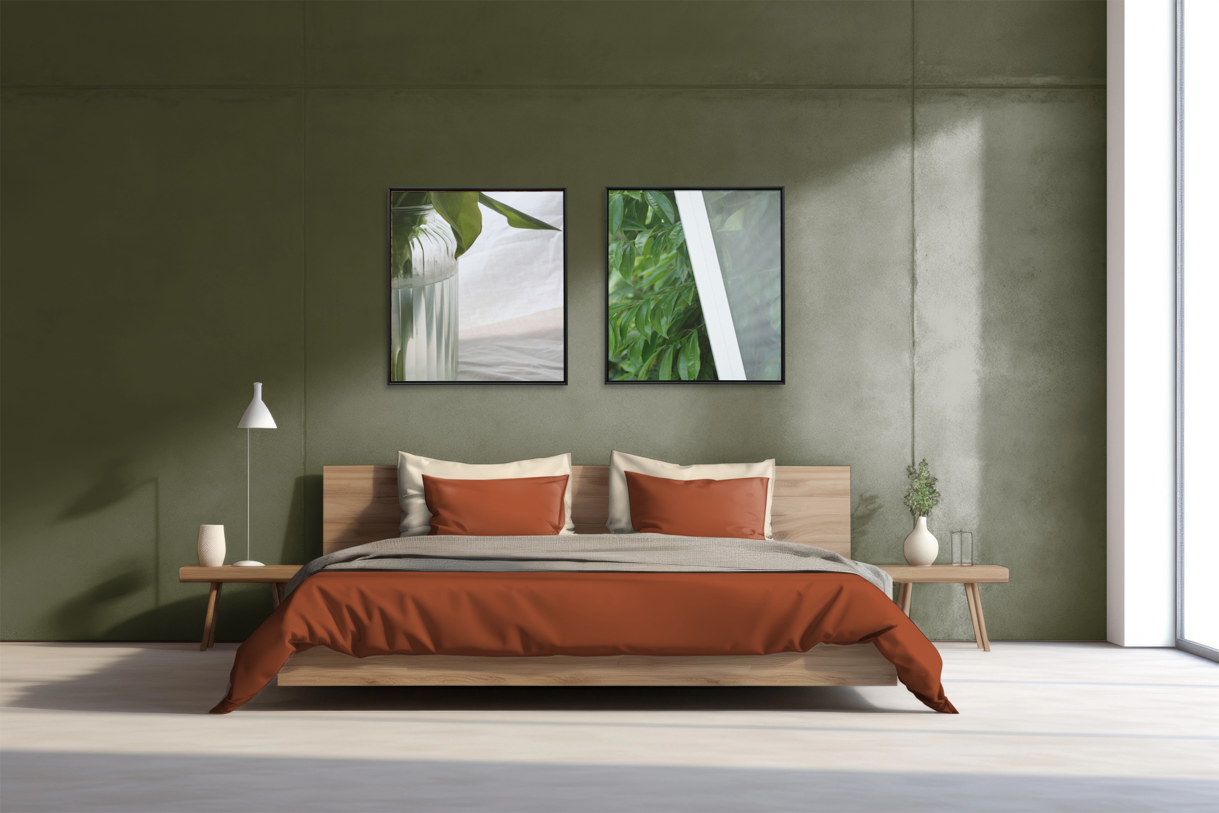
Feeling a bit lost in the art-pairing game? It's totally understandable; the process can be a tad overwhelming. But fear not! I've got your back. I've rounded up some tips that I personally swear by when curating a series of art for my own space and deciding how to pair my photos for my grouped series.
Art is all about personal vibes and what resonates with you. However, if you're yearning for a bit of guidance, keep reading! I hope you find these tips helpful.
Colour
When selecting art, I seek out similar colours. They don't necessarily need to be identical, but choosing shades that harmonise with each other is a reliable method to ensure your walls appear cohesive and your space looks well-coordinated.
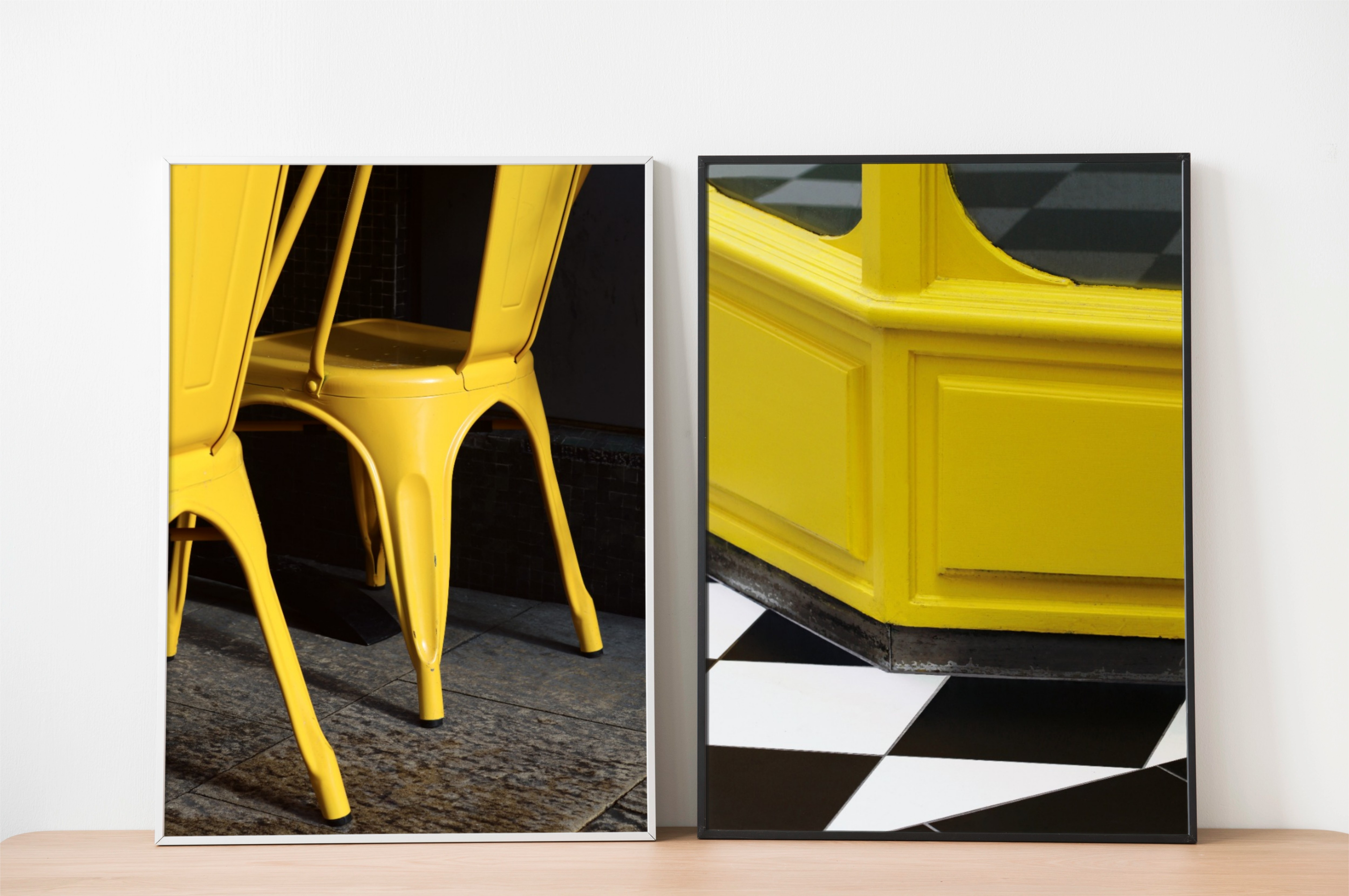
Pairing through colour: similar tones create visual harmony even when subjects differ.
Another approach is to align your art with your interior design. If your room follows a particular colour scheme, selecting art that complements these colours is another secure choice. Take a look at the collections to see how tonal consistency runs through each body of work.
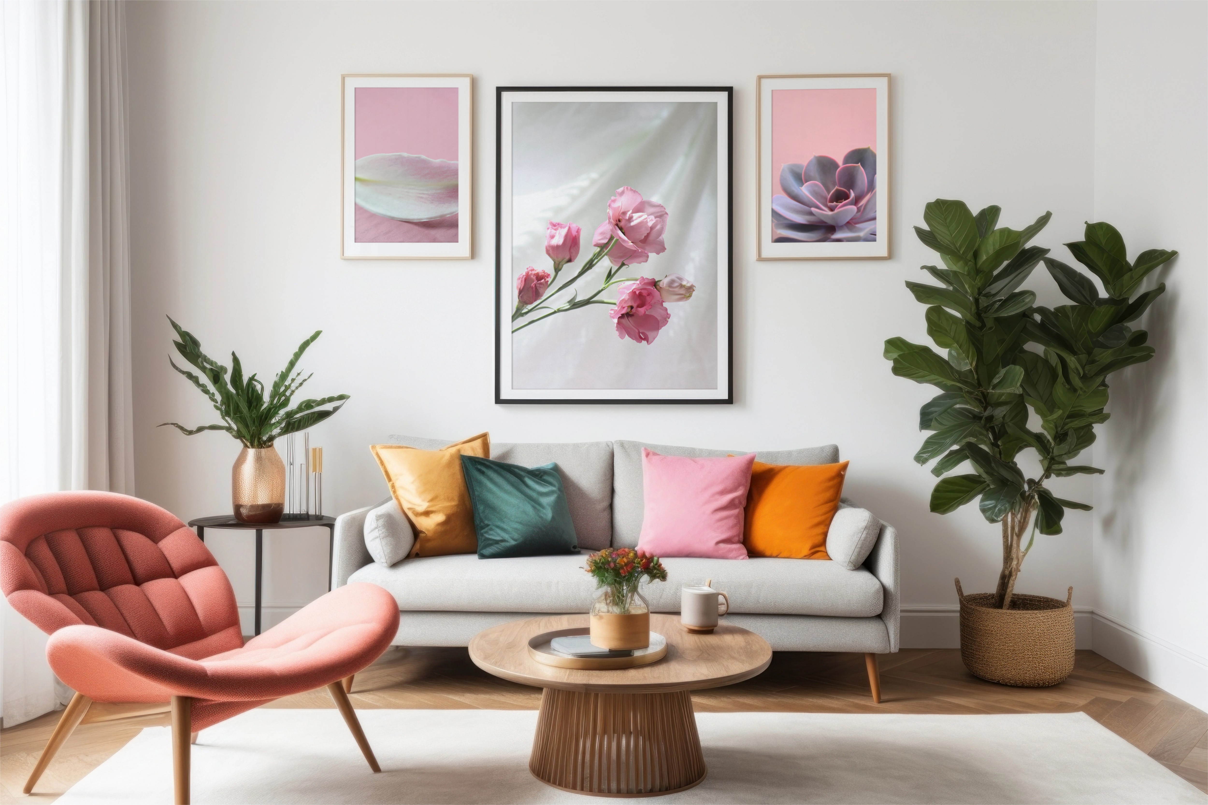
Art that complements your interior colour scheme ties the whole space together.
Subject Matter
Another method for selecting multiple artworks to complement your space is to connect them through a common subject matter. This approach creates a narrative and establishes coherence when the pieces are displayed together.
For instance, consider the theme of "beachfront". While two images may not share identical colour schemes, both being associated with the beach, particularly the British seaside, creates a natural link. By connecting your art through a shared theme, it allows the pieces to harmonise and avoid conflicting with one another.
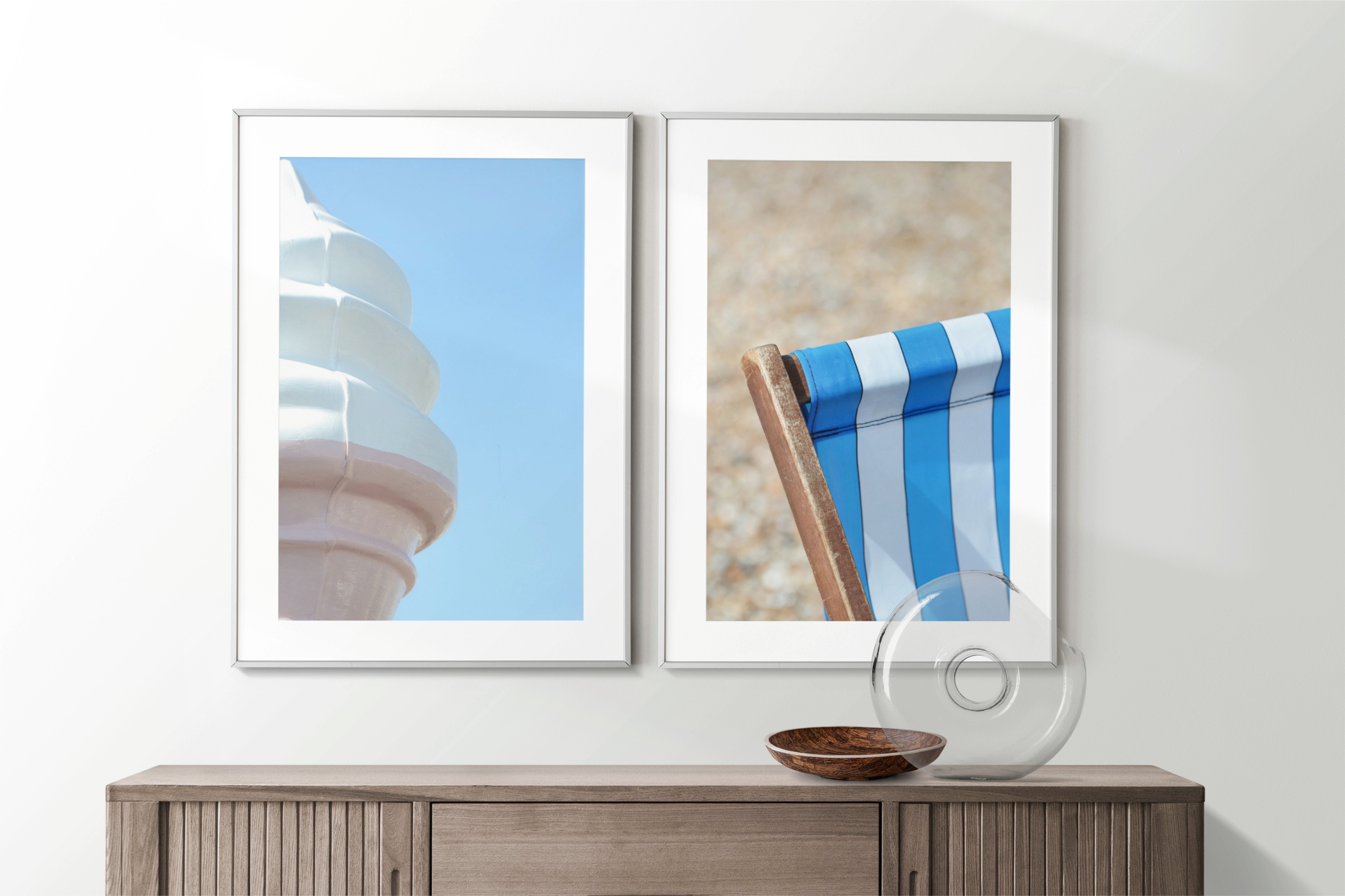
A shared theme — like the British seaside — creates a natural link between different images.
Experiences and Interests
Art has the ability to tell a story. If you feel a connection to a piece, whether it be through the location, subject matter, or artist, incorporating it into your home or workspace provides an excellent conversation starter. People love hearing stories, so artwork that elicits specific memories or triggers a particular emotion is always a success and a great talking point.
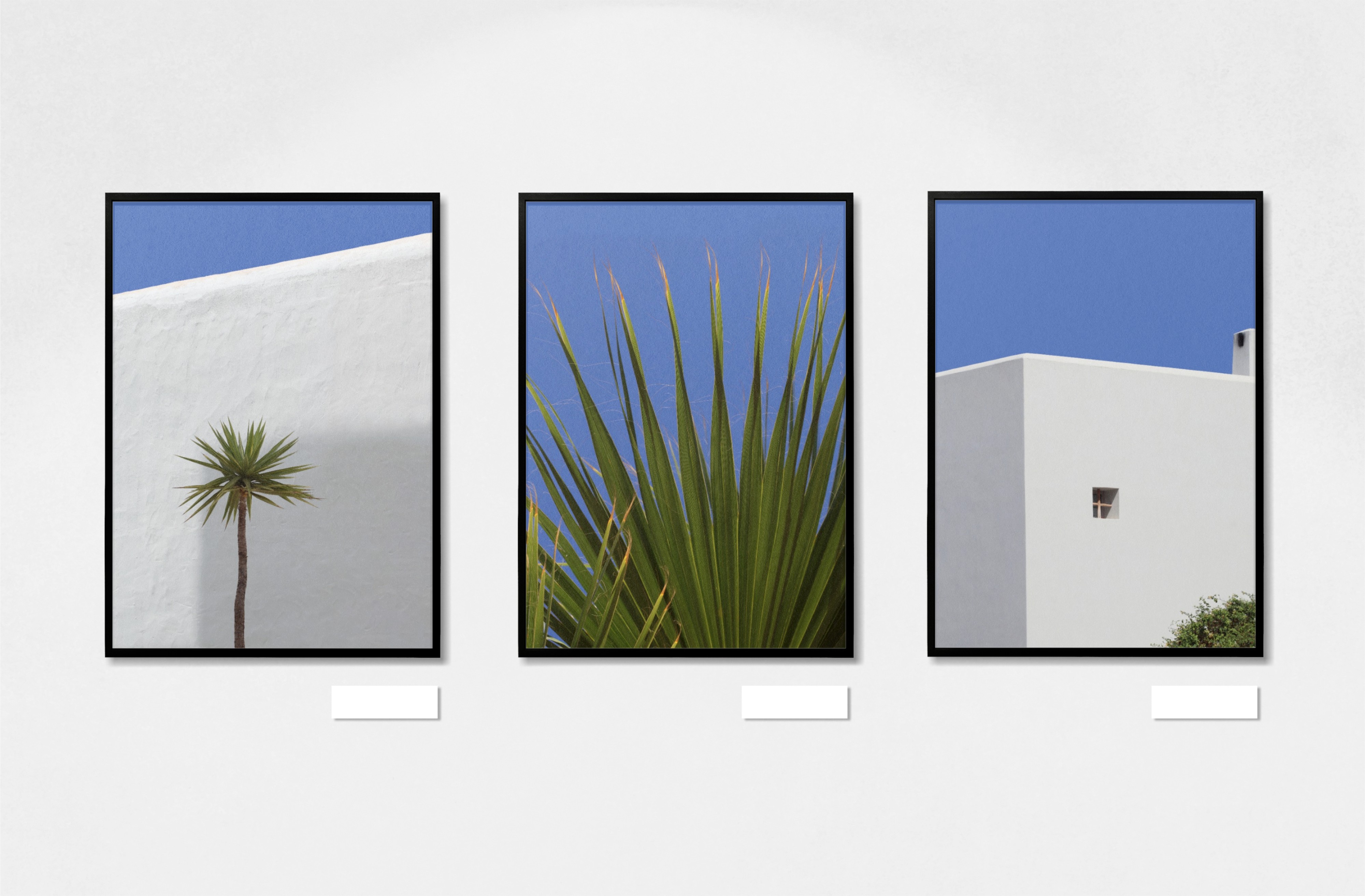
A triptych from the same collection — shared location and light bind the series together.
Ready to Start Pairing?
Browse the collections and find pieces that speak to you
Whether you're drawn to colour harmony, a shared theme, or a personal connection, the right pairing starts with exploring what resonates.
Explore CollectionsMy Favourite Combinations
Some of my most successful pairings come from mixing within a single collection, where the tonal palette and mood naturally align, while others come from unexpected cross-collection combinations that share a compositional rhythm or emotional quality. The key is trusting your instinct and letting yourself be drawn to what feels right.
I hope you've found this useful! Get in touch if you have any thoughts or tips of your own, I'd love to hear them.